Portfolio Reviews
A portfolio review, is an interview type assessment were you present a series of your work/portfolio, to a professional photographer where they give advice and review your work. These are beneficial in terms of getting both your name and work out to people within the industry to help gain opportunities and jobs.
As a part of the third year of my degree, I participated in two portfolio reviews which helped me gain confidence and skills in this area, which will be transferable to job interviews as well as portfolio reviews.
Preparation
Consideration of the Presentation
When attending a portfolio review it is important to consider the presentation of your images, as you have to give the reviewer a good impression. The presentation of your work will help you stand out from the rest if done correctly. The first thing that I considered when it came to the presentation of my work was how I was going to display it. For this I decided to display it in a box, as this is a professional way of doing it and I think it helped best reflect my commercial portfolio. What I looked for in a box was:
That the box lies flat - This allows for easier movement of
the images during the review as the
reviewer or yourself can take the
picture and slide it over to the lid.
This reduces the turning of images
and makes it quicker and simpler
for the reviewer.
Make sure it is good quality - A good quality box helps
give the impression that
your work is good, as a bad
quality box could reflect
that you are not
experienced and not serious
about the work.
Not too large - If the box is too large this can become
clumsy to view as the pictures will be hard
to move and transport. I think the best
size is A3 but this is just a personal
opinion.
Consider the inside of the box - The colour of the inside
of the box is a large
factor to the
presentation of the
work, as depending on
the colour this can either
compliment or
contradict the images. I
would personally stay
away from bright colours
as this may seem
unprofessional, however,
colours such as white,
black and grey would
help compliment and
make the images stand
out more.
Personalisation - Personalising the box with your name or
a QR code to your website inside the box
can be unique and can make a reviewer
remember your work and name.
It is also important to consider the paper stock when it comes to printing the images as again the quality of this can boost your work. In terms of paper this can be dependant on and unique to the type of work you are presenting. For example, if you are doing a commercial portfolio, like myself, I think paper stocks such as semi-gloss (not too shiny as this can distort your images) are effective in boosting the quality of the images, paper stocks such as munken smooth are also successful.
Sequencing
Sequencing is an important part of any publication whether it be a book, magazine or even a website as this helps tell a story and best compliment the images. So after printing my images on A3, semi-gloss stock I laid out my images concentrating on sequencing. Once this was decided I asked for opinions and tweaked it accordingly. TIP: I think it is best to start with a strong image. This is the sequence I decided upon:
The Portfolio Review
For the portfolio reviews I presented to two people, Josh Wilde a commercial product photographer and Lois Jordan a digital retoucher.
Portfolio Review with Josh Wilde
Josh Wilde is a commercial photographer who started his early career assisting for numerous photographers and worked his way up from there. One day Mamas & Papas contacted him via his website, to shoot some of their products. This helped kickstart his freelance career, he has now been a freelance photographer for eight years.
My review with Josh was very beneficial and allowed me to gain great advice and critical feedback upon my photography and retouching alike. Furthermore, Josh gave me great advice on how to improve and stated I could message him on social media if I have a question or any enquires.
Upon looking through my images it became instantly obvious to both Josh and myself that the retouching aspects of my imagery were weak. This is because there were little parts of editing I had missed, for example erasing a section of a layer which stood out on the prints. With this he noted that I needed to check the images thoroughly and do test prints beforehand, furthermore he gave me advice on how to edit more efficiently. For example for the image below:
Josh advised that I should reduced the saturation on the edges of the box, as this helps to reduce the amount of pink that has been reflected. I then altered the image as seen below. This was an interesting technique as this is something I had not thought about and an issue I have run into before, so it was useful to get a resolution to this issue.
Progressing more into the improvements of my retouching skills, when commenting and reviewing the image shown below, Josh pointed out this image would be more successful in black and white as this will ensure the shoe looks perfect white, instead of an off-white. Furthermore, he commented on the fact that some elements on the shoe are over-exposed and the image would be technically stronger if this was not the case, this would need to be reshot in the future.
Advancing more into the act of taking pictures, he commented that the ideas I am creating are good, however he believes my creativity is something that is being held back with me thinking there is a right or wrong way of doing things. He would like me to make a decision and stick to it as this may result in stronger images.
Furthermore, he believes I could advance my work with incorporating more lights when taking the images. The introduction of additional lighting will produce stronger, more professional images portraying a more appealing product. Josh explained that some of his product shots incorporated twelve lights and a composition of forty images to make a single shot. This has inspired me to improve my in camera techniques and has pushed me to try harder to get a good image.
At the closing stages of this portfolio review, I raised my concern that I have self-doubt and lack of confidence in my skill. Josh was quick to reassure me that it is very easy to doubt yourself in photography and this is something that I will probably experience for the rest of my career, as he does it too. He then stressed the importance of looking back on previous work to see the progression made. He also told me to carry on with the hard work so that I can improve the best I can before the end of the course. He added, that only twenty percent of what he knows and learnt in photography was in University, and the rest was learnt out in the industry either observing or doing.
Portfolio Review with Lois Jordan
Lois Jordan is a digital retoucher who works professionally at the Hut Group which is a professionally run business.
Again, like Josh, my portfolio review with Lois was very beneficial and enabled me to gain different advice and opinions on my work. Interestingly, both Josh and Lois picked and commented on completely different aspects of my images which was highly helpful for myself.
Similar to Josh’s approach, Lois started by going through my images, asking me about the work and why I was producing it. This process in itself was useful, as it allowed me to verbally communicate what I was trying to communicate with my work. This was helpful, allowing me to gain confidence in verbally explaining my work and helped me build on valuable skills that I can utilise in the future, in further portfolio reviews and job interviews. Furthermore, she commented that some of the white on selected products, had a green tint, which can be reduced using the colour selection tool.
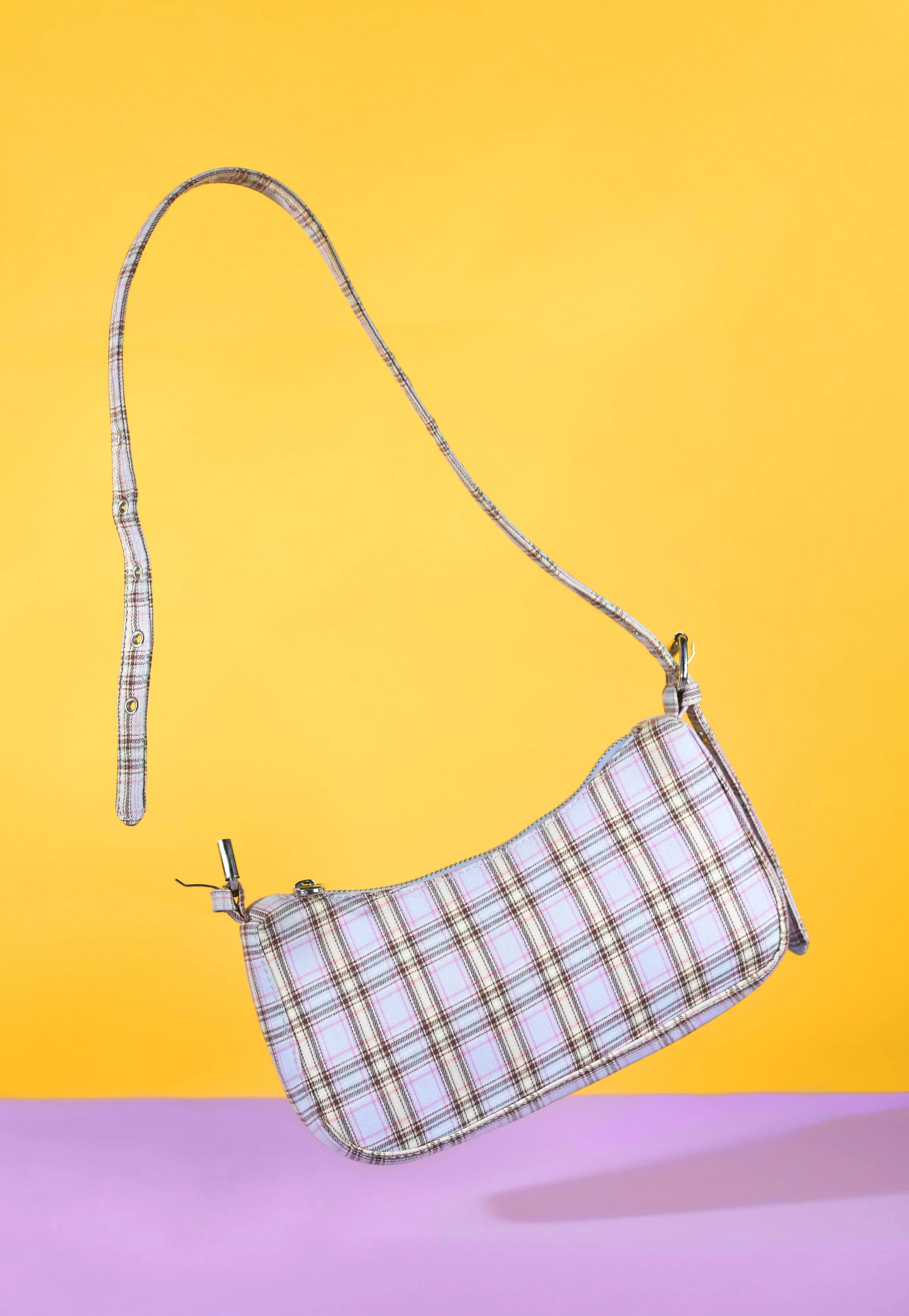
As Lois looked at my images again she helped pick out what could be better in each image, for example the image of the bag shown below.
On this she expressed her liking of this particular image, but commented that the image would be strengthened if the pattern and texture of the bag stood out more. She then explained and showed me on her laptop how to do this by using the afterpath on photoshop.
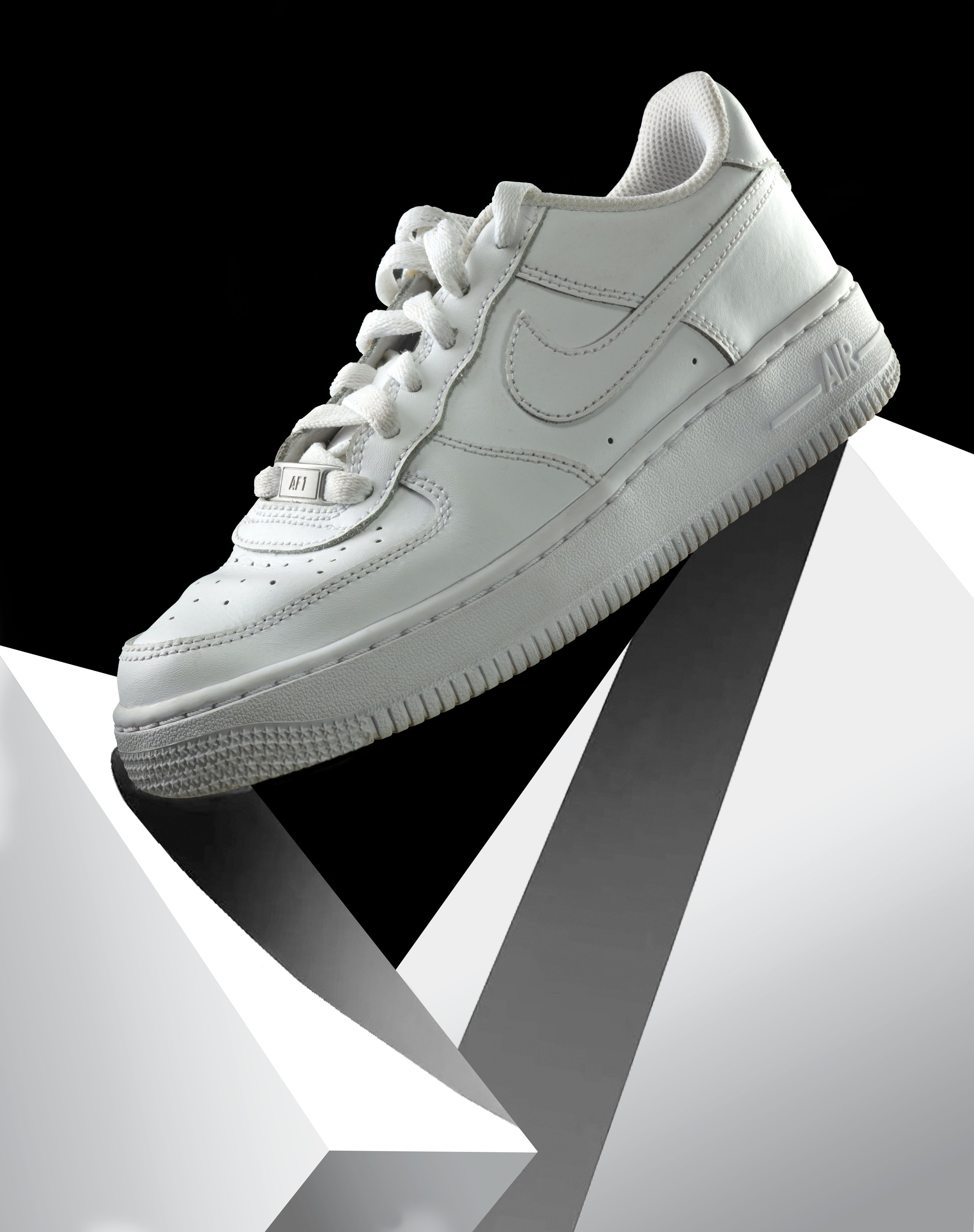
Another image that she thought could be further advanced in post-product is my image of a shoe, shown below.
Upon reviewing this images, Lois believed this was one of the strongest images within my portfolio, however this could again be advance through post-production. She continued that the shadow underneath the shoe looks artificial (which they are), however, Lois commented that if you feather the selection it will make the lines look smoother. She then continued to explain that when you select and fill a section of the image, the edges selected go jagged due to the pixels. Therefore, when you feather the selection this allows the lines to look smoother and therefore less artificial. This was interesting as this is something I gained knowledge in, which has allowed me to advance my images further, without having to reshoot.
TOPTIP: She also gave me the advice, when creating a reflection of a product, for example a bottle, including a white gradient with a low opacity will make the reflection seem realistic.
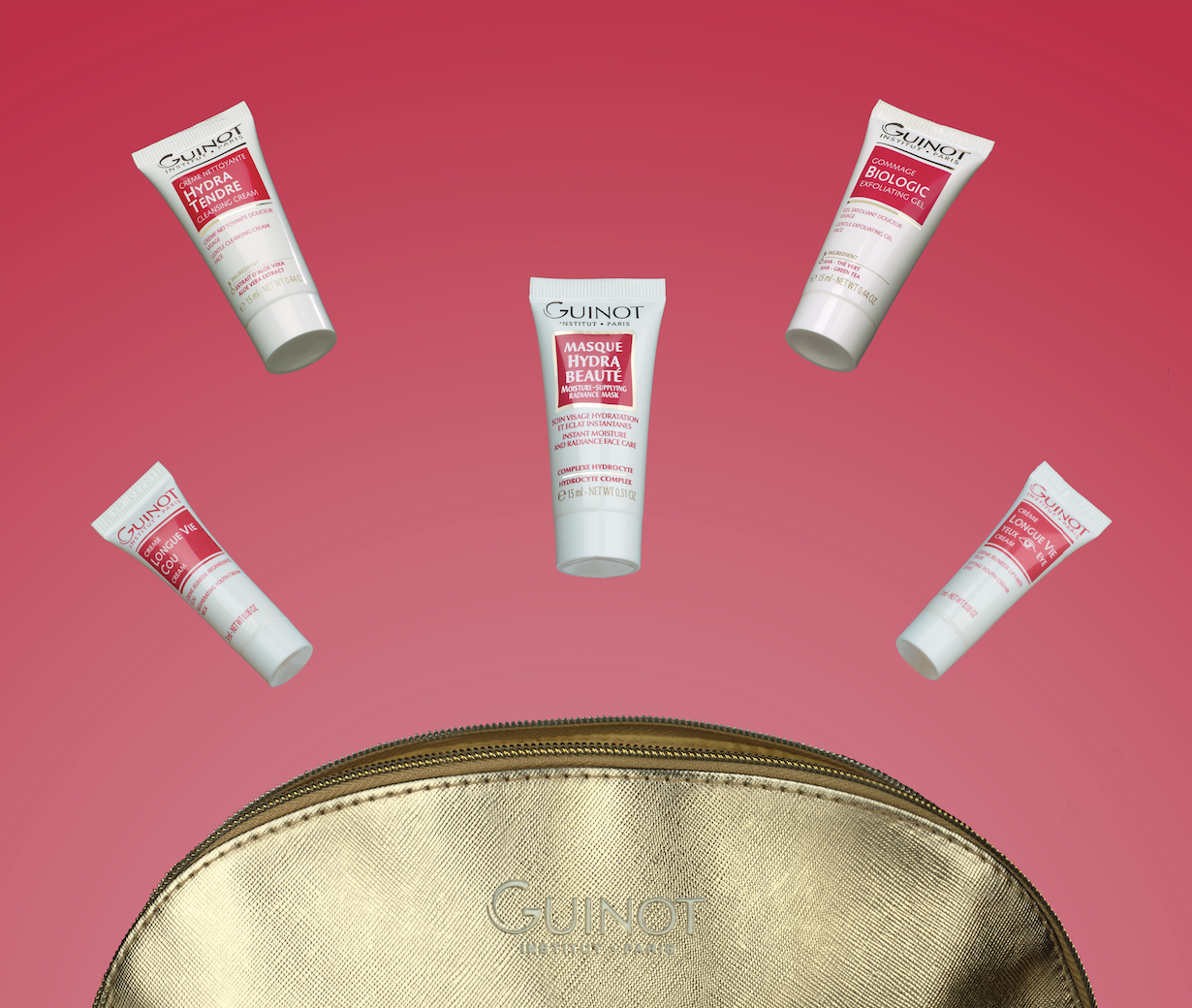
Upon looking through my images multiple times, she asked which ones I was considering putting up for the graduate exhibition in June. I told her I was thinking of including the shoe picture, which she instantly agreed with. She then added to this, that the face cream image, represented below, would be a successful addition to my exhibition. Which is something I am definitely considering including.
To conclude this portfolio review, Lois advised me to sign up for the graduate internship that the Hut Group, who she works for, offers. For this, you have to go through a series of tasks for example, a screening test, a technical test and finally an interview in order to get this, however you only require entry level experience to apply. She commented that I was a determined individual, who has a great passion for product photography and confidence to apply for the internship as it is my ambition to work in a studio. This is an opportunity that I am highly considering.
Portfolio Review Conclusion
The portfolio review was a highly rewarding process, which allowed me to further advance my skills and confidence when talking about my work to practitioners. Furthermore, this allowed me to gain direction with my portfolio and my work, focusing my attention on aspects that need to be improved, especially post production. It allowed me to understand what psychically worked with my portfolio itself. For example from this process I found it handy to have boarders around my work as this allowed the reviewer to be able to touch the image without putting their fingerprints on the work. Additionally, the size of the portfolio, A3, seemed to work successfully. However, a few things I am going to change are printing on different paper stocks, as the semi-gloss was too shiny and hindered the reviewer seeing the image clearly.
For myself, this process was successful and allowed me to gain confidence in not only myself but in my work also. This has therefore, prepared me for post-course environments and has allowed me to gain a greater understanding of what portfolio reviews are about and how they are helpful in advancing and improving work.


